
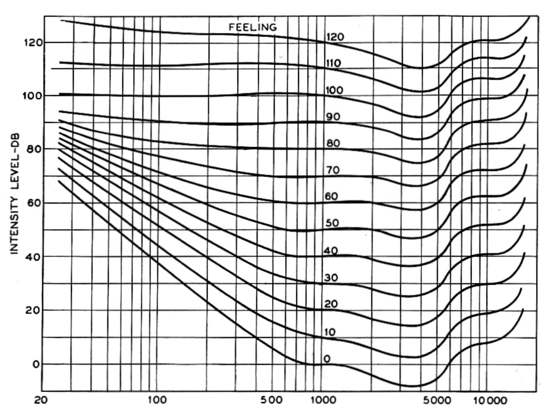
If you’ve ever wondered why a mix sounds different at low versus high playback volumes, you’re bumping into a century-old psychoacoustic phenomenon: the Fletcher-Munson curves, also known as equal-loudness contours. These curves describe how our ears perceive loudness differently across frequencies, depending on sound pressure level (SPL). While they have evolved over time into more refined ISO standards, the original Fletcher-Munson data remains a seminal contribution to both audio engineering and psychoacoustics.
Brief history lesson
Harvey Fletcher and Wilden A. Munson published their now-famous paper in 1933 after performing meticulous experiments at Bell Labs. Their goal? To quantify how the human ear perceives “equal loudness” across different frequencies. The result was a set of contours with each representing a constant perceived loudness level, or phon, across the frequency spectrum.
These contours were foundational for everything from consumer electronics design to broadcasting standards. Despite being superseded by later measurements like ISO 226, Fletcher-Munson remains a common reference point, particularly in music production and audio plugin development.
The Problem: No Tabulated Data
While the curves themselves are widely reproduced as images, precise tabulated numerical data isn’t readily available for the original Fletcher-Munson curves. This posed a problem when developing the APU Loudness Contour plug-in.
In order to design a filter, you need to know the precise frequency response across the entire frequency spectrum. The Fletcher-Munson curves are typically presented as images, which makes it difficult to extract the underlying data points.
So what to do…?
WebPlotDigitizer
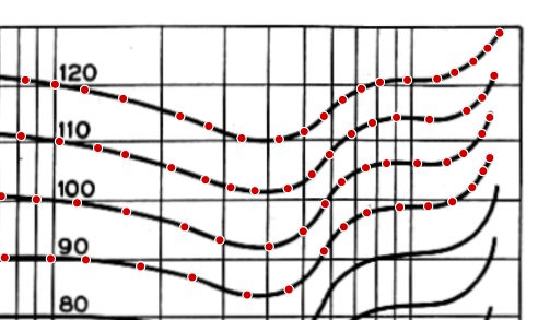
Fortunately, I stumbled upon a tool called WebPlotDigitizer. This web-based application allows you to extract numerical data from images of plots. By taking a screenshot of the original Fletcher-Munson curves and uploading it to WebPlotDigitizer, you can meticulously trace the curves and extract the underlying data points.
The tool allows you to specify key points on the axis and then uses an affine transformation to map the image coordinates to actual data values, making it a powerful resource for anyone needing to convert visual data into numerical form. It is even capable of correcting the mild distortion in the original plots, which is a common issue with scanned images.
Why bother?
While ISO curves are more accurate and widely accepted today, it didn’t seem right to ignore the original Fletcher-Munson data. The Fletcher-Munson curves are a historical milestone in audio engineering, and they still hold relevance in understanding how our ears perceive sound.
So, now you can use the Fletcher-Munson curves in your own projects. In addition to the original curves, you can seamlessly set your reference level to intermediate values and they will be automatically interpolated for you. You can apply the contours with adjustable frequency response weight, including inverted response.